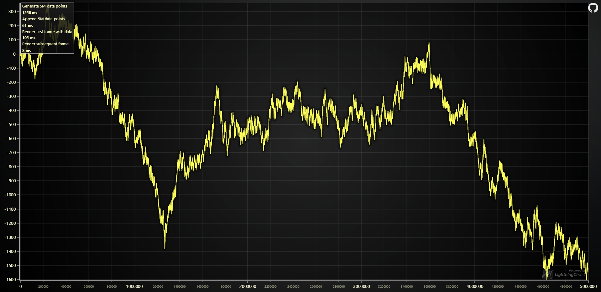
Static data speed test
Measures the time (in milliseconds) required to visualize a Line Chart with 5 000 000 data points.
Result is shown on Chart.
Measures the time (in milliseconds) required to visualize a Line Chart with 5 000 000 data points.
Result is shown on Chart.
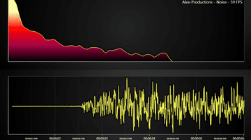
High-performance real-time audio visualization JavaScript with LightningChart JS. This example helps visualize MP3s audio files in real-time.
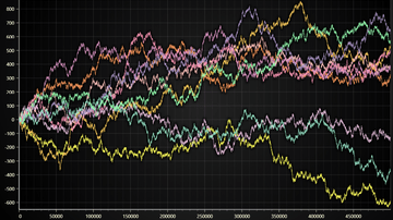
Example visualization of large line chart (several million data points)
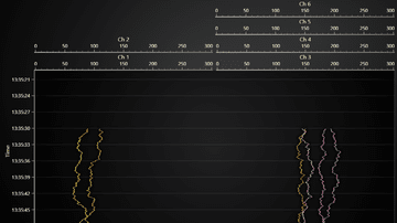
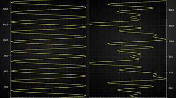
Lightning-fast Line Chart visualization over multiple channels that progress on the same X Axis
Showcase of axis layout capabilities of LightningChart JS
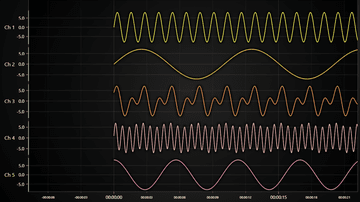
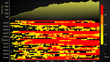
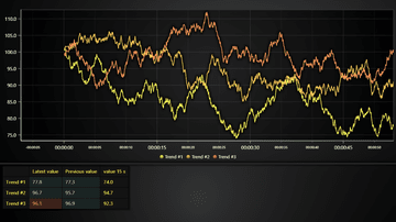
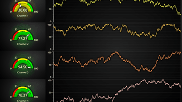
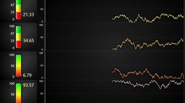
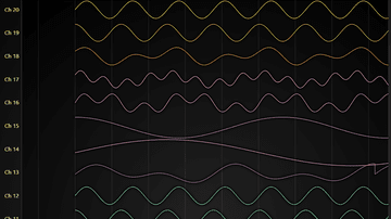
Intensive multi-channel real-time application example with LightningChart
Intensive multi-channel real-time application example with LightningChart
Example showcasing Line Series feature for coloring line dynamically based on Y coordinates
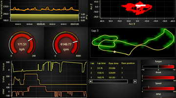
Motorsports industry inspired LightningChart JS real-time dashboard example
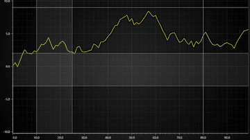
Minimal example of showing time-series line chart with LightningChart JS
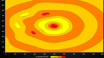
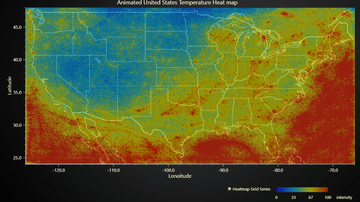
Example showcasing simple usage of Heatmap Grid Series.
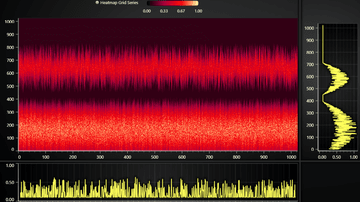
Example for Chart with 2D spectrogram + dynamic projections on mouse interaction.
This example showcases a real life application used in Fiber Analysis
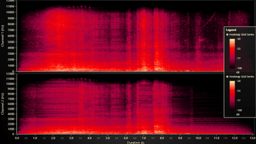
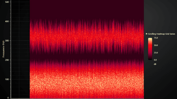
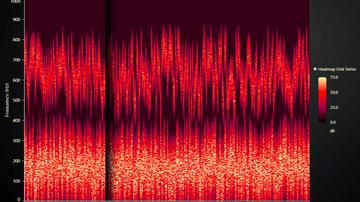
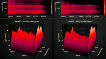
Example showcasing 2D audio analysis spectrogram with LightningChart JS
Example showcasing simple usage of Scrolling Heatmap Grid Series
Example for Sweeping Heatmap Chart using HeatmapGridSeries
Example that showcases the pixel interpolation mode feature of 2D Heatmaps.
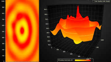
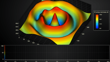
Example showcasing the Surface Grid Series feature of LightningChart JS.
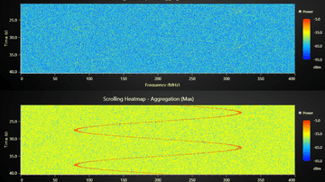
Example showcasing Heatmap Aggregation
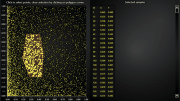
Scatter chart example featuring an integrated zoom overlay.
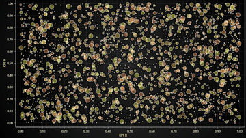
Example of using LightningChart PointSeries for an interactive Bubble Chart with individual point sizes and data grouping to different colors.
Example visualization of large scatter chart (> million data points)
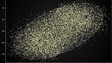
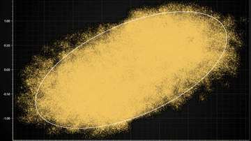
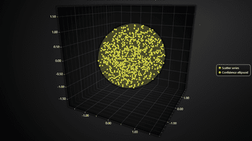
Example showcasing visualization of XY confidence ellipse widely used in statistics field

Example of displaying scatter data sets with custom pictures
Dynamic 2D points coloring by arbitrary user data set.
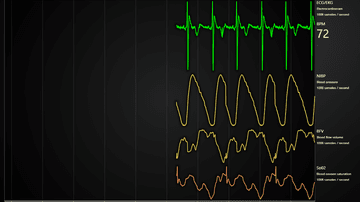
Example of a Medical Dashboard with ECG/EKG, blood pressure, flow volume and oxygen saturation.
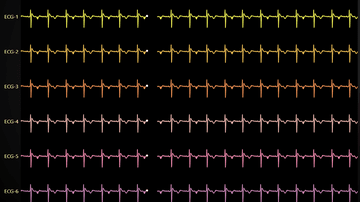
Showcases sweeping ECG line chart with LightningChart JS
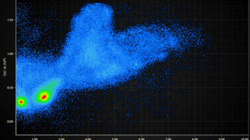
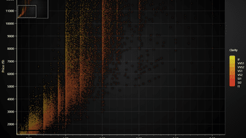
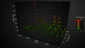
Visualization of a Flow Cytometry data set (FSC + SSC properties)
Example showcasing 2D audio analysis spectrogram with LightningChart JS
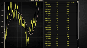
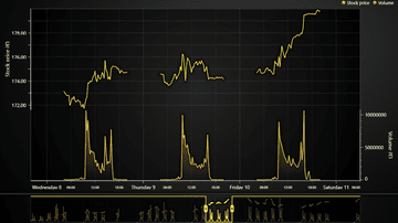
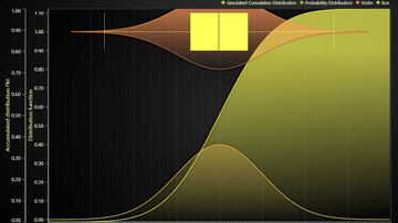
Example showcasing Range Selectors and Chart Interactions
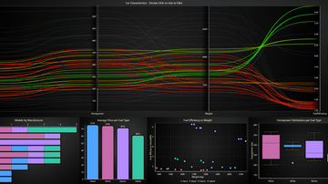
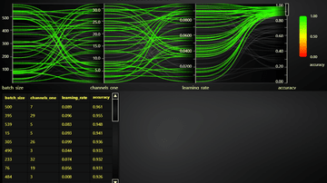
Example of changing Parallel coordinate chart data in real-time.
Example of displaying a large data set with Parallel coordinate chart
Example showcasing Range Selectors feature
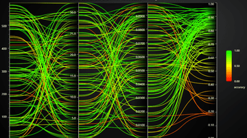
Example of using the built-in color by value feature of Parallel coordinate chart
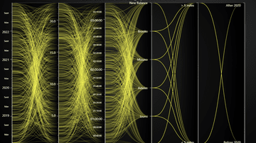
Example of Category and Date-Time Axes with Parallel coordinate chart
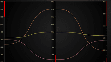
Example of common use case to display value thresholds on different axes. E.g. which value range is _bad_ and which is _good_.
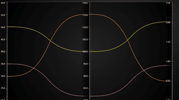
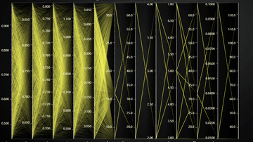
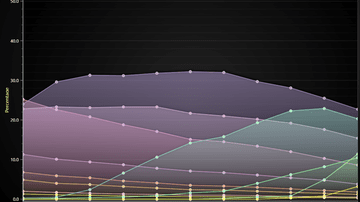
Basic example of Parallel coordinate chart feature
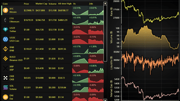
Example of Data Grid in Cryptocurrency Dashboard use case with drilldown.
Example of Data Grid in real-time monitoring use case.
Example of Data Grid in real-time monitoring use case with dynamic cell coloring heatmap
Example showcasing a custom ChartXY interaction for highlighting selected data points
Example of interactive slicing of 3D chart with planes.
Example showcasing the use of 3D Time Series.
Example of a simple custom user interaction in a 3D surface chart
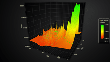
Example showcasing visualization of a 3D scatter data set using a Surface Chart

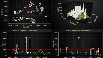
Example showcasing visualization of a 3D LiDAR scanned park with over million data points
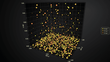
Example of using LightningChart PointSeries3D for an interactive 3D Bubble Chart with individual point sizes and data grouping to different colors.
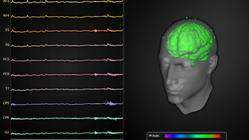
Visualization of EEG data with 3D Mesh Model and line charts
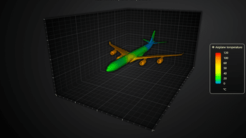
Example of realtime coloring a 3D Mesh Model.
Example showcasing the Surface Scrolling Grid Series feature of LightningChart JS.
Example showcasing the use of 3D Line Series.
Example showcasing simple usage of BoxSeries3D and the rounded edges feature.
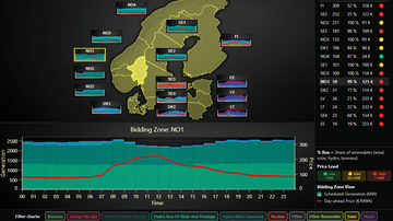
Interactive dashboard for the Nord Pool day-ahead market. Links geospatial overviews with deep statistics on regional energy production.
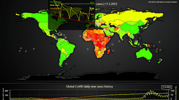
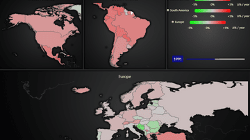
In-depth example of map dashboard with data drill-down. Visualizes relations between CoVID vaccinations and cases
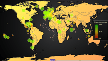
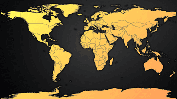
Animated map chart that visualizes the progression of first round of CoVID-19 vaccination coverage per country
Example on geographical data visualization by laying a 2D heatmap over a picture of a map.
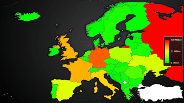
Example of using MapChart with real data set and dynamic region coloring
Example on using MapChart with animated real-time data set
Simple overview of the Map Chart feature
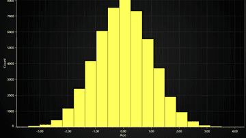
Example of a LightningChart JS Histogram chart.
Bar chart race shows the dynamics of the Covid-19 spread.
Bar Charts show discrete numerical comparisons across categories, where the value represents the height of a bar. Also known as Bar Graph, Column Chart or Column Graph.
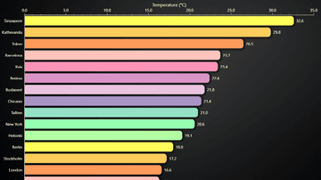
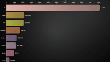
Horizontal variant of a Bar Chart. Also known as Bar Graph, Column Chart or Column Graph.
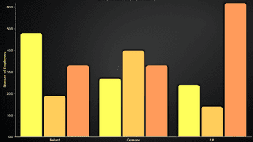
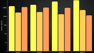
Grouped bars for better categorizing than normal bar chart. Also known as Multi-set and Clustered Bar Chart.
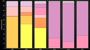
This example shows the creation of a Stacked Bars Chart with LightningChart JS.
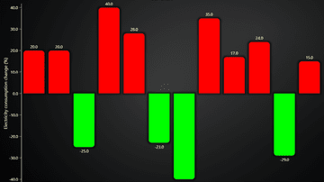
Example showcasing grouped bars chart with Logarithmic Y Axis
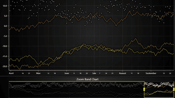
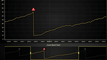
This example shows the creation of a Zoom Band Chart.
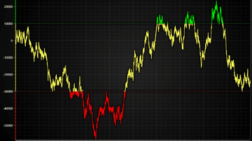
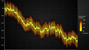
Example showcasing how data gaps can be handled XY series. Particularly highlights line and area series in a trading use case
Example showcasing custom events display in a time-series XY chart
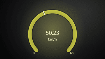
This example shows the new reworked gauge chart.
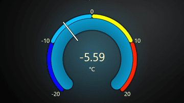
This example shows the use of value indicators in a gauge chart.
This example shows gauge charts on a dashboard with real-time data.
This example shows linear gauge charts on a dashboard with real-time data.
Example showcasing visualization of XY confidence ellipse widely used in statistics field
Example showcasing 3D variant of popular 2D statistics data visualization method of confidence ellipses
This example shows usage of BoxSeries in extravagant manner.
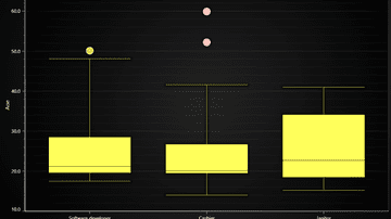
Example creates a traditional Box and Whiskers Chart using ChartXY, BoxSeries and PointSeries for outliers.
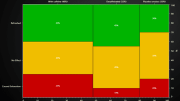
Mosaic Chart can be used to compare observation counts of groups across different categories. Also known as Marimekko Chart.
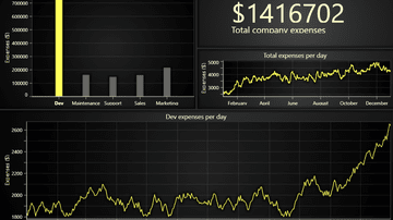
This example shows the specific business case to visualize the costs of a imaginary company across all the departments combined in a single interactive dashboard.
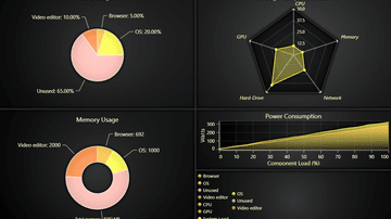
This example shows different kinds of charts inside a dashboard.
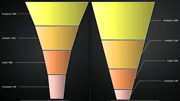
Funnel Chart is a chart used to show statistical graphic. Funnel Chart is divided into slices, with each slice illustrating the numerical portion of the Funnel.
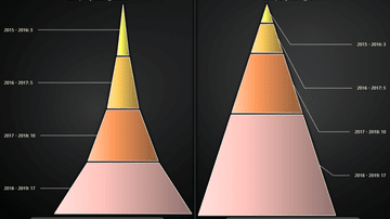
Pyramid Chart is a chart used to show statistical graphic. The Pyramid chart is divided into slices, with each slice illustrating the numerical portion of the whole Pyramid.
Example showing a dashboard with multiple chart types and Legend Panel.
Also known as a Range Bar, Column Graph, Floating Bar Graph, Difference Graph, High-Low Graph.
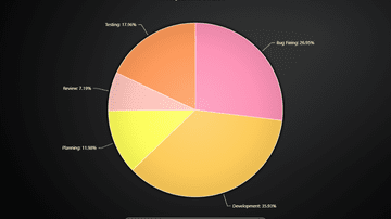
Pie Chart (or a Circular Chart) is a chart used to show statistical graphic.
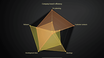
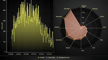
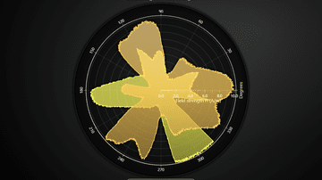
This example shows the basic use of Spider Chart. Also known as Radar Chart, Web Chart, Polar Chart, Star Series.
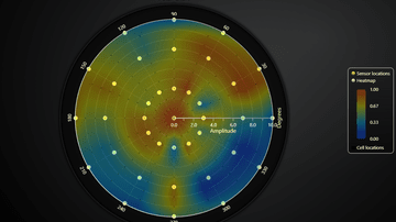
Example of Polar Sensor data visualization in real-time
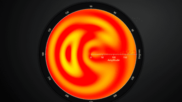
Polar Radar Heatmap example
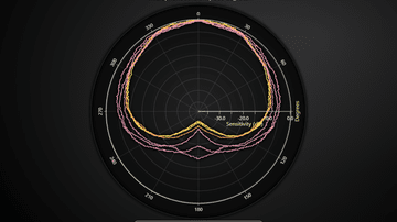
PolarChart showcase with LineSeries
PolarChart showcase with AreaSeries
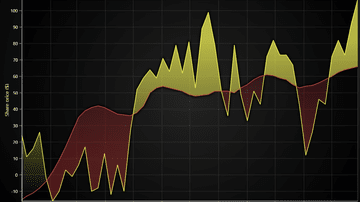
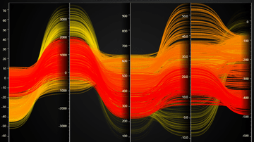
Example showcasing basic use of an Area Range Series. Also known as a Area Graph, Area Chart or Range Area Chart.
Layered Area Chart done by layering multiple Area Series on top of each other. Also known as a Layered Area Graph, Layered Area Chart or Multiple Area Charts.
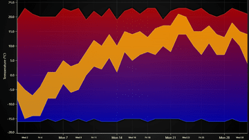
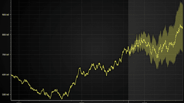
The example shows the basic usage of Area Range series to display variation in temperature.
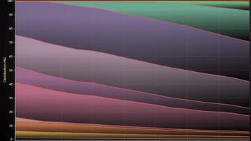
Stacked Charts are a popular visual aid for comparing parts of a whole. Also known as Stacked Area Graph or Stacked Areas.
Example of displaying annotations in a time series line chart. Annotations can be deleted, added and moved with custom user interactions.
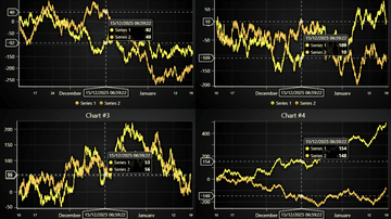
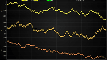
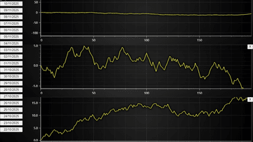
Example of synchronizing cursors across several time series in separate charts
Example of a Dashboard with several channels which you can re-arrange with drag & drop and hide/show at will.
Example on how a dynamic chart dashboard can be created with LightningChart JS
Example of a freeform canvas where you can have any number of charts with free control over draw order and positioning

Example showing how a time-series chart where user can drag and drop annotations
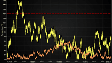
Example showcasing use of ConstantLine and DashedLine style in a threshold indicator.
Example showcasing use of DashedLine style to reflect a projected (or predicted) time trend.
This example shows usage of Bands and ConstantLines in XY Charts.
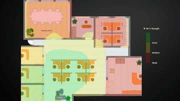
Example showcasing LightningChart interactions with external images and icons in context of office layout data visualization.
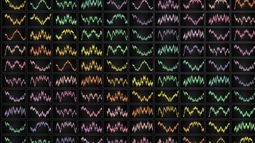
This example shows different progressive data-patterns, scrolling strategies, custom axes and function generators inside a dashboard.
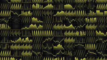
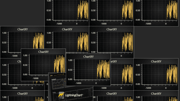
Showcases how to fit a large number of charts into 1 by utilizing HTML scroll bars


